***** ALERT - Nominations for your new ClubCJ Committee can be made here *****

Tadz' Studio Arts Folio

Car Images, Wallpapers/High Res, Photography Skills & Idea's.

Moderators: Moderators, Senior Moderators

User avatar
tadz0rz
Genius
Genius
Posts: 6955
Joined: Sun Mar 08, 2009 8:54 pm
Location: Melbourne, VIC, Australia
Contact:

Tadz' Studio Arts Folio

Postby tadz0rz » Sun Oct 02, 2011 8:55 pm

Hey guys

Over the past year I have been working through a project for studio arts. I did it on Automotive Light Painting Photography. I then needed to develop a final piece which had a central idea, and my central idea was a video game.

I have been a bit slack as of late uploading photos but it has come down to the final few weeks of getting my folio ready and I thought it would be about time to show everyone my work. Theres still alot to do but I have completed one of my final pieces.

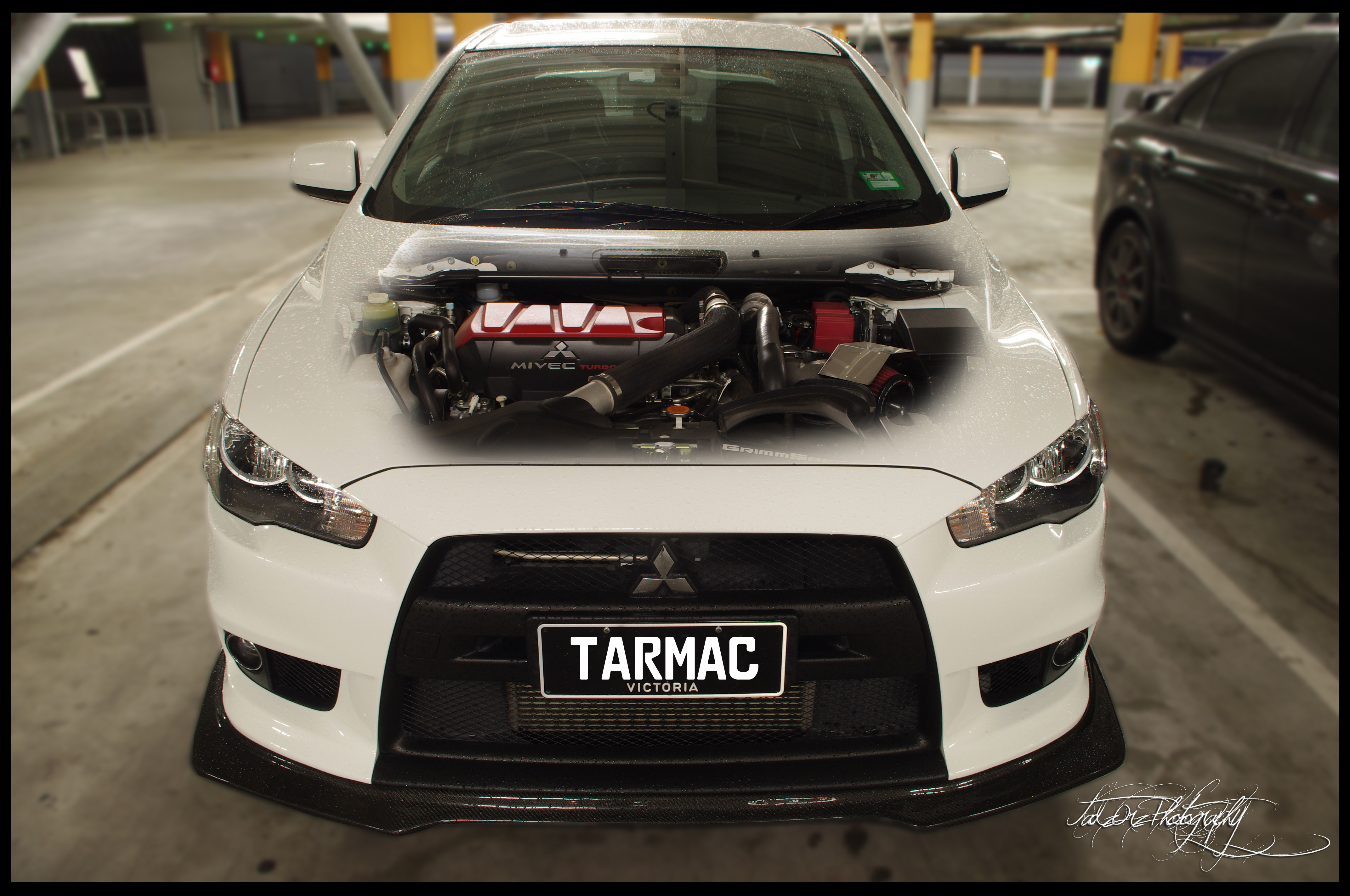
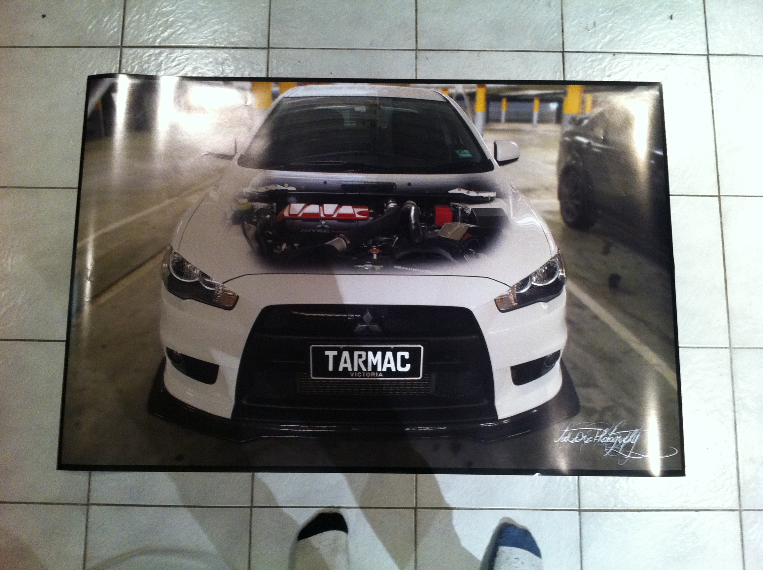
This is a picture of EvolX's evo X. I edited it using photoshop and then printed it out to A0 size. Im really quite proud of this and obviously there is more coming from this but I thought I'd share what i've been working on the past few months since Ive been to a few meets, taken photos and havent really posted anything up. The photos are coming however I just need to make sure they are edited properly...
Image

Image

Feedback would be awesome, ill update this thread as often as I can including pictures from the meets ive taken photos at along with photos ive taken privately.

Thanks guys :)
Got a question? Read the ClubCJ Ultimate Guide First!!
Image
Just...Dont worry about it ;)Dont Click Me

User avatar
aspir3
Site Admin
Site Admin
Posts: 8415
Joined: Tue Oct 27, 2009 6:15 pm
Location: adelaide

Postby aspir3 » Sun Oct 02, 2011 8:58 pm

You are wearing different colour socks in the bottom picture.

User avatar
tadz0rz
Genius
Genius
Posts: 6955
Joined: Sun Mar 08, 2009 8:54 pm
Location: Melbourne, VIC, Australia
Contact:

Postby tadz0rz » Sun Oct 02, 2011 9:05 pm

Thanks for your feedback Troy, much appreciated <3

Here is another one of my final pieces, it is the actual game cover and game disc. The discs dont have anything on them just yet however I am planning on burning a slideshow on the disc that is able to be played on a TV or something to showcase a bit further the other work that I have done.

Image
Got a question? Read the ClubCJ Ultimate Guide First!!

Image

Just...Dont worry about it ;)Dont Click Me

User avatar
aspir3
Site Admin
Site Admin
Posts: 8415
Joined: Tue Oct 27, 2009 6:15 pm
Location: adelaide

Postby aspir3 » Sun Oct 02, 2011 9:09 pm

They look good Michael, very impressive.

The "C" on the number plate looks a little wrong.

User avatar
Mitch
Alumni
Alumni
Posts: 4105
Joined: Sat May 29, 2010 2:09 pm
Location: Brisbane Australia

Postby Mitch » Sun Oct 02, 2011 9:10 pm

looks reallly good tads well done xbox 360 for the win :-)

User avatar
tadz0rz
Genius
Genius
Posts: 6955
Joined: Sun Mar 08, 2009 8:54 pm
Location: Melbourne, VIC, Australia
Contact:

Postby tadz0rz » Sun Oct 02, 2011 9:16 pm

Pylee's Evo X

Image

This has been laminated on A4 paper, however I am thinking about blowing it up to a larger size and getting it put on a piece of foamcore board.
Got a question? Read the ClubCJ Ultimate Guide First!!

Image

Just...Dont worry about it ;)Dont Click Me

User avatar
PYLee
Lancer MASTER
Lancer MASTER
Posts: 1808
Joined: Wed Aug 05, 2009 1:29 am
Location: Melbourne, VIC

Postby PYLee » Sun Oct 02, 2011 9:41 pm

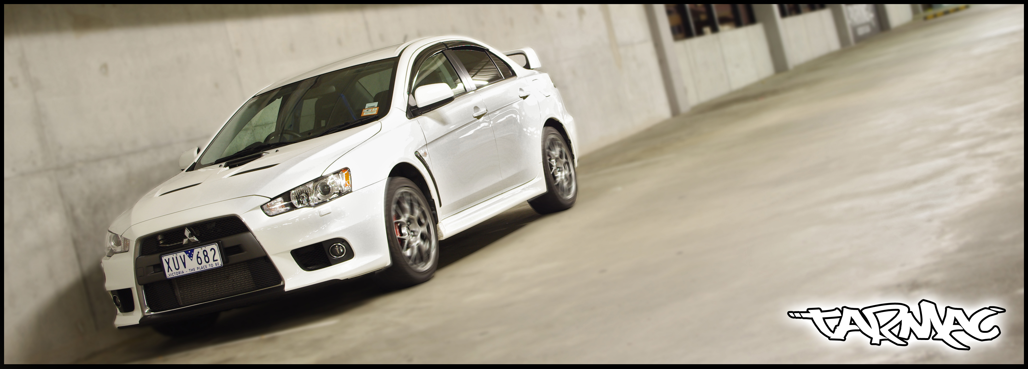
nice work mate , one suggestion for the above picture would be to remove the motion blur on the wheels or just motion blur the whole background more to give it a movement feel. It's currently quite clear that you've photoshoped the wheels
Lancer Evolution 10MR

User avatar
tadz0rz
Genius
Genius
Posts: 6955
Joined: Sun Mar 08, 2009 8:54 pm
Location: Melbourne, VIC, Australia
Contact:

Postby tadz0rz » Sun Oct 02, 2011 10:04 pm

I played around with photoshop for about an hour trying to make it look like the background was moving along with it however I couldnt get it to work properly. I just decided in the end to add the radial blur to the wheels and gaussian blur to the background. Thanks for the Suggestion though man :)
Got a question? Read the ClubCJ Ultimate Guide First!!

Image

Just...Dont worry about it ;)Dont Click Me

User avatar
PYLee
Lancer MASTER
Lancer MASTER
Posts: 1808
Joined: Wed Aug 05, 2009 1:29 am
Location: Melbourne, VIC

Postby PYLee » Sun Oct 02, 2011 10:40 pm

hmmm i think its something like cutting out the whole car on photoshop and motion blur the whole background and paste it back in , not too sure , never really used photoshop lol love to know how to use it but never gotten the chance to play around with it yet !

let me know if you need a hand with it , i'd be keen to help if i could lol
Lancer Evolution 10MR

User avatar
tadz0rz
Genius
Genius
Posts: 6955
Joined: Sun Mar 08, 2009 8:54 pm
Location: Melbourne, VIC, Australia
Contact:

Postby tadz0rz » Mon Oct 03, 2011 10:56 am

Yeah thats what I've been doing. However the motion blur when selected around the car doesnt quite make the car look like its moving. Was a massive pain since I couldnt get it exactly how I wanted but I still feel the same sort of look was achieved. Thanks Lee, ill give you a bell if i need a bit of help :)
Got a question? Read the ClubCJ Ultimate Guide First!!

Image

Just...Dont worry about it ;)Dont Click Me

User avatar
ClubspecCustomDesigns
Club Sponsor
Club Sponsor
Posts: 890
Joined: Wed Mar 25, 2009 7:36 pm
Location: Melbourne, VIC, Australia
Contact:

Postby ClubspecCustomDesigns » Mon Oct 03, 2011 11:13 am

Looks Awsome Tadz. ill have a copy. :-)
Looking for that ultimate ride??
ClubSpec Custom Designs
www.facebook.com/ClubspecCustomDesigns

Image

User avatar
craigeth
Lancer VR/GT
Lancer VR/GT
Posts: 249
Joined: Thu May 19, 2011 11:25 am
Location: Cairns, Australia
Contact:

Postby craigeth » Mon Oct 03, 2011 11:22 am

I love the A0 picture with the see through bonet. Might have to to something like that myself shortly! Well done.
Twenty Three Frames - Photography and Video Production
www.twentythreeframes.com

User avatar
Tarquin
Lancer Legend
Lancer Legend
Posts: 1015
Joined: Wed Sep 03, 2008 8:54 am
Location: BrisVegas, QLD, Australia

Postby Tarquin » Mon Oct 03, 2011 9:37 pm

Nice Pic m8 !!

I like the motion blur on the wheels, but would have blacked out the windscreen a bit so you can't see it has no driver... That's the bit that looks freeky with the wheels spinning....

Directional blur FTW.... :) Nice perspective to play with then, too...

Trick I know with PS with this is to copy/paste the background cutaway you have manipulated heaps and heaps of times.... It oddly fills in all the holes you made along the way.
- CCJ Premium Member #0015.
Image
Tarq's Paintshop

User avatar
craigeth
Lancer VR/GT
Lancer VR/GT
Posts: 249
Joined: Thu May 19, 2011 11:25 am
Location: Cairns, Australia
Contact:

Postby craigeth » Mon Oct 03, 2011 10:14 pm

Duplicate the background, and make a selection around the car. Feather the selection so that it isn't so harsh.

Now hit ctrl+j or cmd+j to duplicate the selection onto a new layer.

Now try a few different directional blurs on the below layer. Because the car is still on that layer as well you should get a nice bit of blur from the car.

As Tarquin said I'd definitely black out the windows. Just on that top car layer, make another selection around the windscreen and then maybe feather it a little, dunno try a few different techniques. Then use the burn tool set to shadows to make it all darker. Do that for all the windows. And keep the blur on the wheels!
Twenty Three Frames - Photography and Video Production

www.twentythreeframes.com

User avatar
funnyfi
Lancer VR/GT
Lancer VR/GT
Posts: 227
Joined: Wed Feb 03, 2010 1:35 am
Location: Sydney, Australia

Postby funnyfi » Mon Oct 03, 2011 11:56 pm

I personally think you should get rid of the blur on the wheels if the background isn't blurred either (not talking about depth of field blur), it doesn't really convey motion well like PYLEE said, I think you're trying to achieve the panning effect from photography in which case the background should be blurred as well as the wheels

e.g. like this photo I took at WTAC
Image

also composition-wise, I don't think creating the sense of motion blur works well in that particular shot, people don't drive fast that close to the wall.

the areas of the evo on the A0 near the edges of the car/a pillars seem weird as there's reflections but that's not your fault. umm also the vent from the evo hood should be gone imo, the opacity is low which kind of makes it seem like it's part of the engine bay

The game cover looks and disk looks great

my 2c


Return to “Image Gallery”

Who is online

Users browsing this forum: No registered users and 3 guests